


In case you aren't familiar, I'll use the next two portfolio samples to introduce you to the process.
Sometimes mechanicals don't visually represent the finished piece. For example, on an earlier design in the background, the yellow represents a silver metallic thermography ink and the magenta a gloss varnish.
These are sometimes necessary for presentations before approval to go ahead with production.
To the left, you can see the Ali Miles hangtag, care label, interior woven label, and button envelope. All of which were initially created as mechanicals.
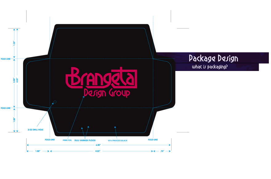
As with all mechanicals, it contains all of the specs the printing factory needs to produce the finished piece.
These were used in Canada, so there was an English version and French version.
It was essentially a simple measuring and prototyping exercise to develop the exact dimensions that would hold different types of glasses without being too loose or tight.
Several designs were prototyped and this proved the most durable.
The magenta lines represent folds and the holes are drilling or punching locations.
Measurements were taken from a pre-existing wooden box and wallet, and the individual pieces were created and prototyped. Represented to the left are the four pieces required to create the packaging.
To see the finished prototype on top of one of the mechanicals, click here.
Several examples are shown on the left.
The cyan (blue) represents a high gloss varnish and the green color was a metallic seafoam.
Copyright ©2020 Brandon Brown. All Rights Reserved. Site Map
Note: If the navbar is missing a button, you need to turn off your uBlock Origin or other ad blocker.